You are not logged in.
- Topics: Active | Unanswered
Announcement
Pages: 1
#1 2006-01-08 21:49:08
- logart
- New member
- Registered: 2006-01-08
- Posts: 7
Buttons are scrambled
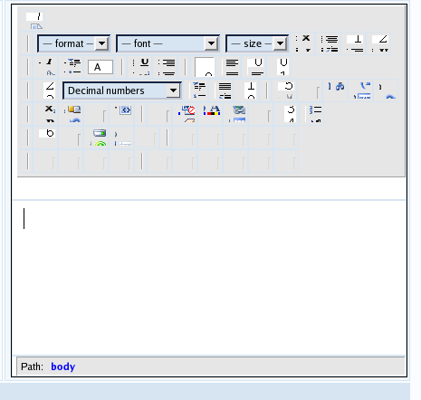
I am having some sort of problem with my xinha textarea implementation. I have it working, but the button menu comes up all out of alignment. I can even see some of the grid numbers showing through. I think there is some sort of problem with the CSS I am using on my site because when I remove all of my css includes, the textarea works as expected. Any ideas?
Offline
#2 2006-01-09 05:47:17
- koto
- Xinha Pro
- Registered: 2006-01-09
- Posts: 58
Re: Buttons are scrambled
I had similar problems once. You're right - CSS files that you use on the page embedding Xinha are the cause. In my case I have resolved this issue with creating new file - htmlarea-custom.css:
/* override styles from Xinha's default htmlarea.css to be compatible with
   native stylesheets */

.htmlarea .toolbar {
  font-size: 0px;
  vertical-align: top;
}

.htmlarea .toolbar img {padding: 0; margin: 0;}

.htmlarea .toolbar select, .htmlarea .toolbar option {padding: 0;}
And telling Xinha to load this stylesheet in xinha_init function like this:
  ...
  HTMLArea.startEditors(xinha_editors);
  HTMLArea.loadStyle('../../css/htmlarea-custom.css'); /* relative to Xinha directory */
Hope this will solve your case!
I think it would be a good idea to include this few CSS rules into Xinha main styles - they do not break anything, they just ensure that Xinha looks the same on many installations no matter what CSS files are used on pages that integrate Xinha.
Offline
#3 2006-01-09 11:45:50
- logart
- New member
- Registered: 2006-01-08
- Posts: 7
Re: Buttons are scrambled
I can't seem to get that code above to make any difference.....
I have xinha installed in a common directory (/usr/local/xinha). I added that css file to that folder, and editied my my_config.js to add that loadstyle command.
Offline
#4 2006-01-09 13:41:33
- logart
- New member
- Registered: 2006-01-08
- Posts: 7
Re: Buttons are scrambled
Here is what it looks like right now....

Offline
#5 2006-01-09 16:17:14
- logart
- New member
- Registered: 2006-01-08
- Posts: 7
Re: Buttons are scrambled
I found the portion of my site CSS that is causing the problem:
#content img,#contentalt img {
border:1px solid #b0b0b0;
float:left;
margin:5px 15px 6px;
padding:5px;
}
and the width attribute in this block:
inputform table {
 background-color: #F9FBFD;
 color: #000000;
 width: 550px;
 border: 1px solid #D7E5F2;
 border-collapse: collapse;
}
Removing those two sections of CSS fixed the scrambled toolbar in the image above.
Still working on how exactly to override these css entries so that xinha will display properly...
Any ideas on how I can override these css attributes?
Offline
#6 2006-01-12 04:15:47
- koto
- Xinha Pro
- Registered: 2006-01-09
- Posts: 58
Re: Buttons are scrambled
#content img,#contentalt imgcould be overwritten with (add rules to .htmlarea .toolbar img):
float: none;
border: none;
and add new rule:
.htmlarea .toolbar table {
width: auto;
}
But there is a problem - the "#content img" rule is more IMPORTANT then ".htmlarea .toolbar img" - the # id selector makes that rule more important. Try to select images with a different rule (avoid #content) on your main CSS file.
You could instead use:
.htmlarea .toolbar img {
padding: 0 !important;
margin: 0 !important;
}
but Internet Explorer would skip these rules ![]()
Last edited by koto (2006-01-12 04:16:47)
Offline
Pages: 1